See full portfolio

Services
Branding
Social Media
Graphic Design
Client
Shirley's Football Club
Year
2023-2024

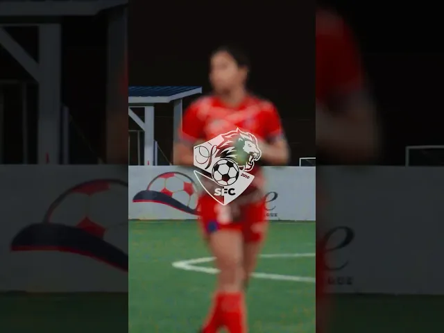
The client envisioned a figure that could represent the heart of the club—something noble, strong, and timeless. The lion was chosen as the central figure, symbolizing pride, strength, and courage. At the same time, the club wanted to preserve its identity by keeping the familiar shield aesthetic from the previous logo. I combined both elements into a unified design. The bold silhouette of the lion stands proudly within the shield, anchoring the club’s values of unity and resilience. The shield provides continuity and heritage, while the modernized lion adds energy and ambition. Together, they create a logo that honors the past while projecting the club’s future.


Sample Highlight Reel
The new logo became the foundation of Shirley’s Football Club’s refreshed identity. It was more than just a mark—it set the tone for how the club presented itself moving forward.
I applied the design across multiple platforms and touchpoints:
Jerseys & Kits: Integrated into new jersey designs, giving the team a bold and unified look on the field.
Social Media: Developed graphics and templates that carried the new identity consistently across announcements, match updates, and promotions.
Video Content: Brought the brand to life through highlight reels, motion graphics, and storytelling pieces.
Club Merchandise: Extended the logo and style system into apparel and accessories, building pride among players and supporters.
This rollout ensured the rebrand was not only visible but also felt—strengthening the club’s image and presence within the community.